Opening Up the Identity
In 5 months, I led a full visual identity update and brand system expansion for Shift4 (NYSE: FOUR) — a Fortune 1000, publicly traded financial technology company serving hundreds of thousands of businesses worldwide. The goal: modernize the brand to match its evolving position in the market.
The existing visual identity relied on a pure black primary color, an extremely narrow color palette, and blue-tinted photography that left little room for hierarchy, personality, or warmth. A space theme applied to the flagship product no longer reflected who Shift4 was or where the brand was headed. It missed the mark for its core audience and industries. The system also lacked a cohesive toolkit: photography direction was minimal, iconography varied inconsistently across departments, and layouts felt one-dimensional.

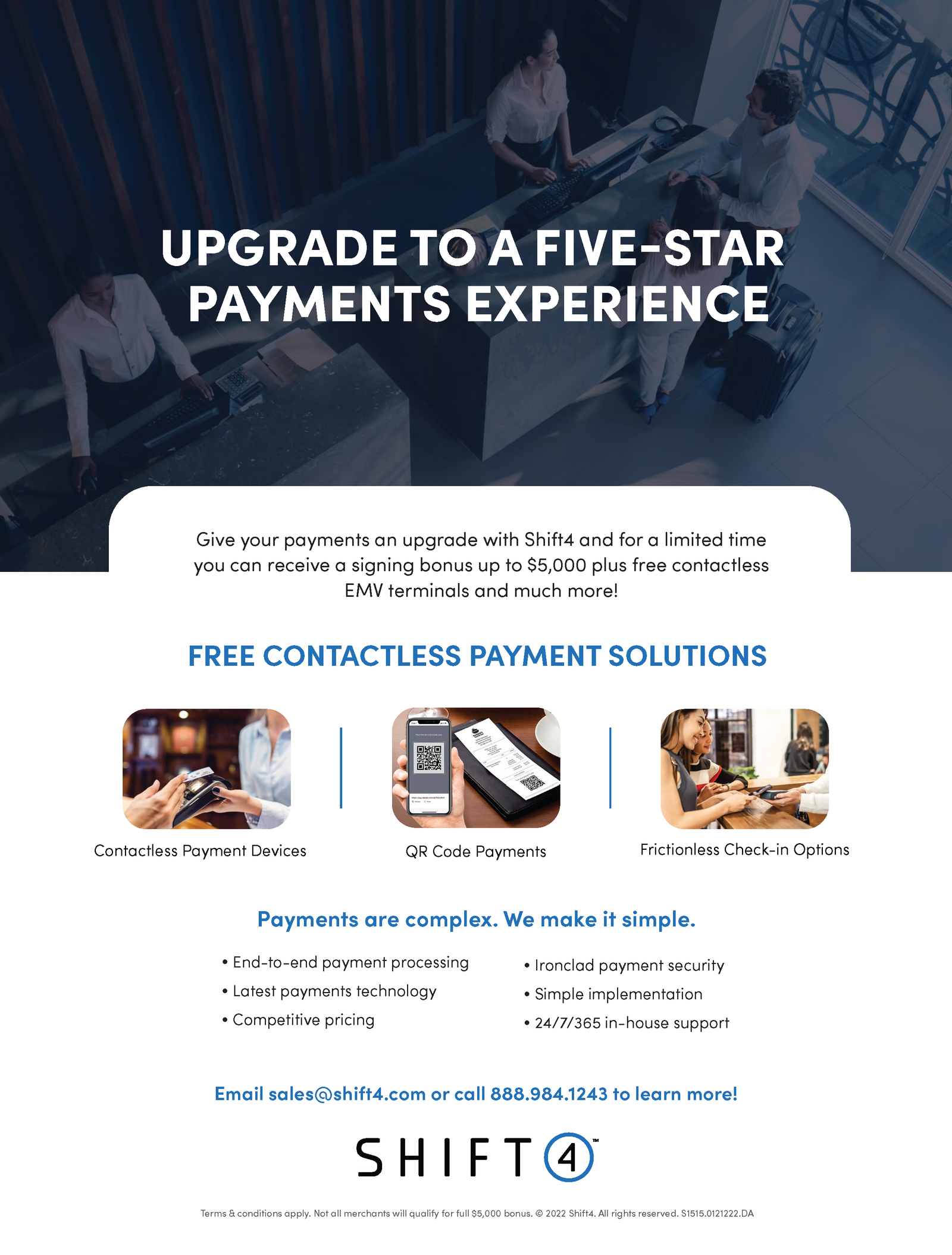
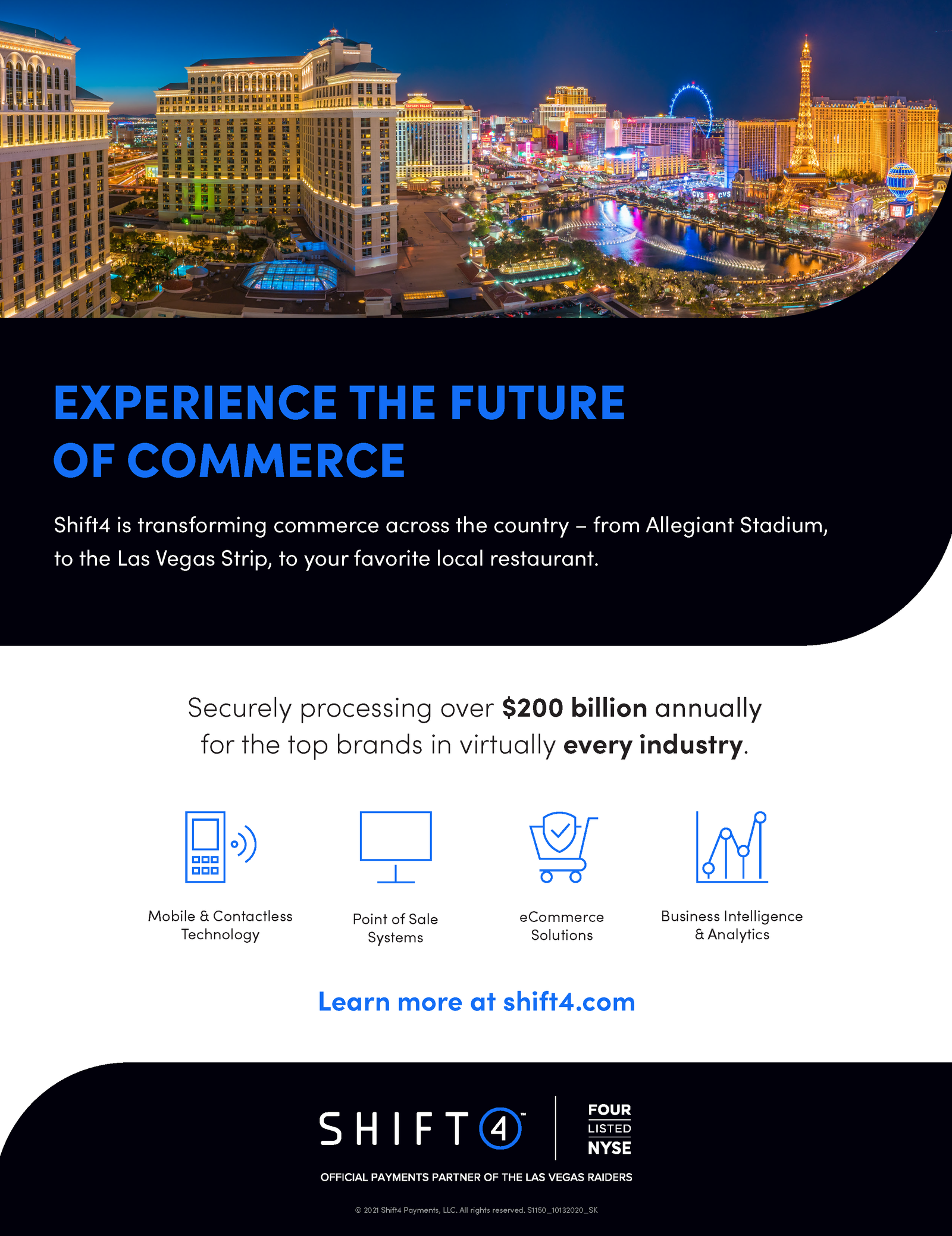
I partnered with the two senior designers on the overall tone, exploration, and direction for the new system. Since our design team is fully remote, I advocated for and secured approval for an in-person collaborative session at Shift4's HQ, working alongside the Marketing team to align on direction before moving forward which resulted in two days of powerful output and ideations .
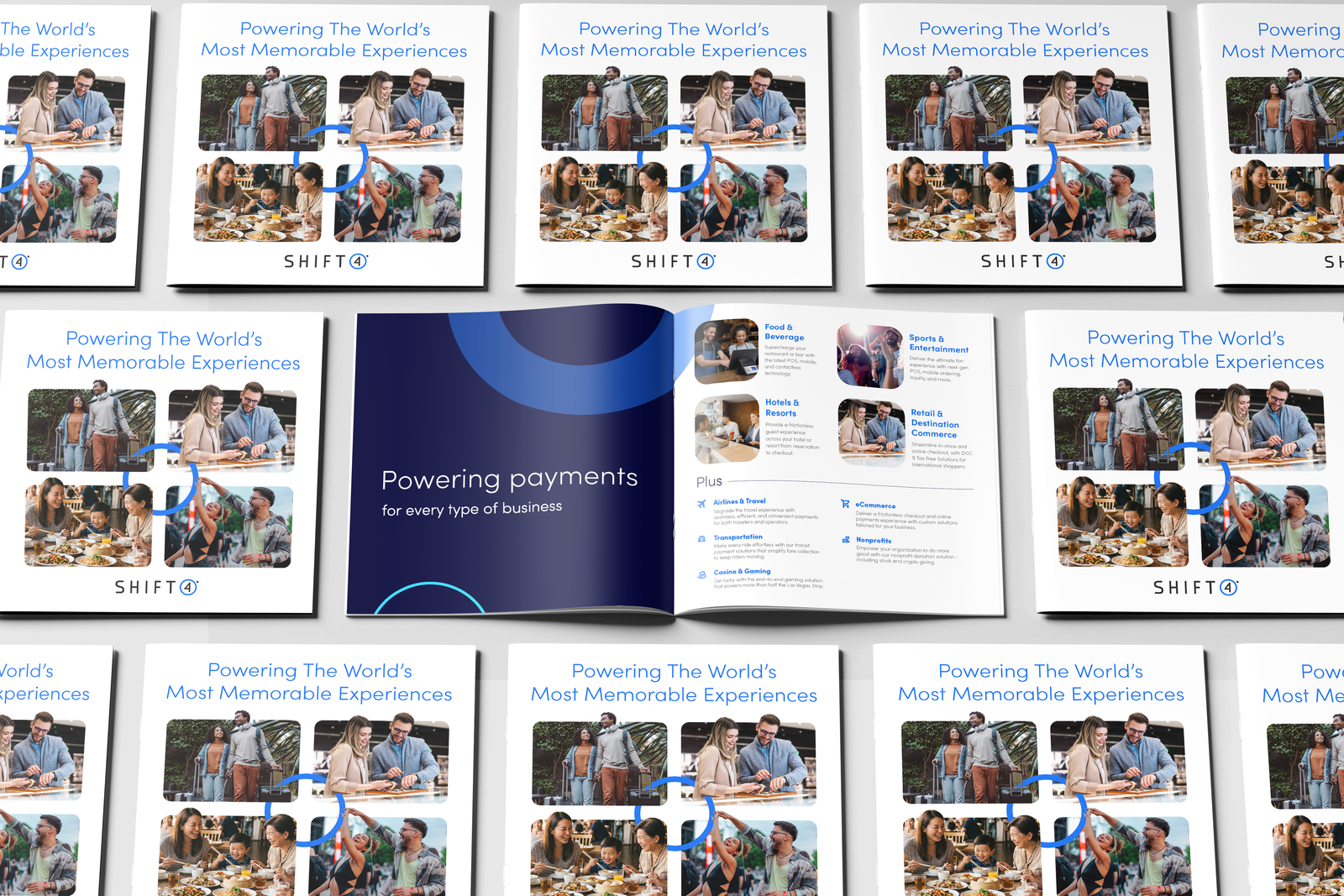
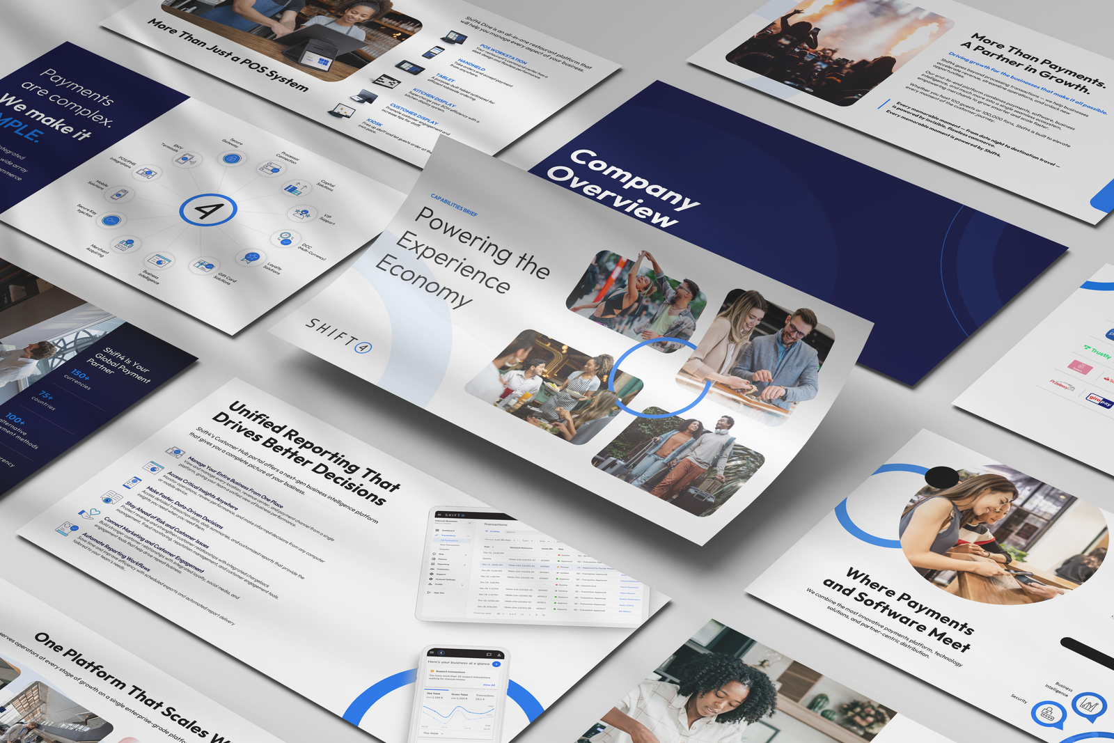
The direction was grounded in a shift happening in parallel on the messaging side. Marketing had repositioned Shift4 around the idea of powering the experience economy, the hidden force behind people's most memorable moments, expressed as "Powering how the world shops, dines, stays, and plays." We translated that idea visually. The Shift4 logo's outline circle became a recurring design element, placed at low opacity behind cutout lifestyle photography, a shift away from the previous product/hardware-focused imagery. The circle sits quietly behind the people in each image, visually representing Shift4 powering the experience without being the center.
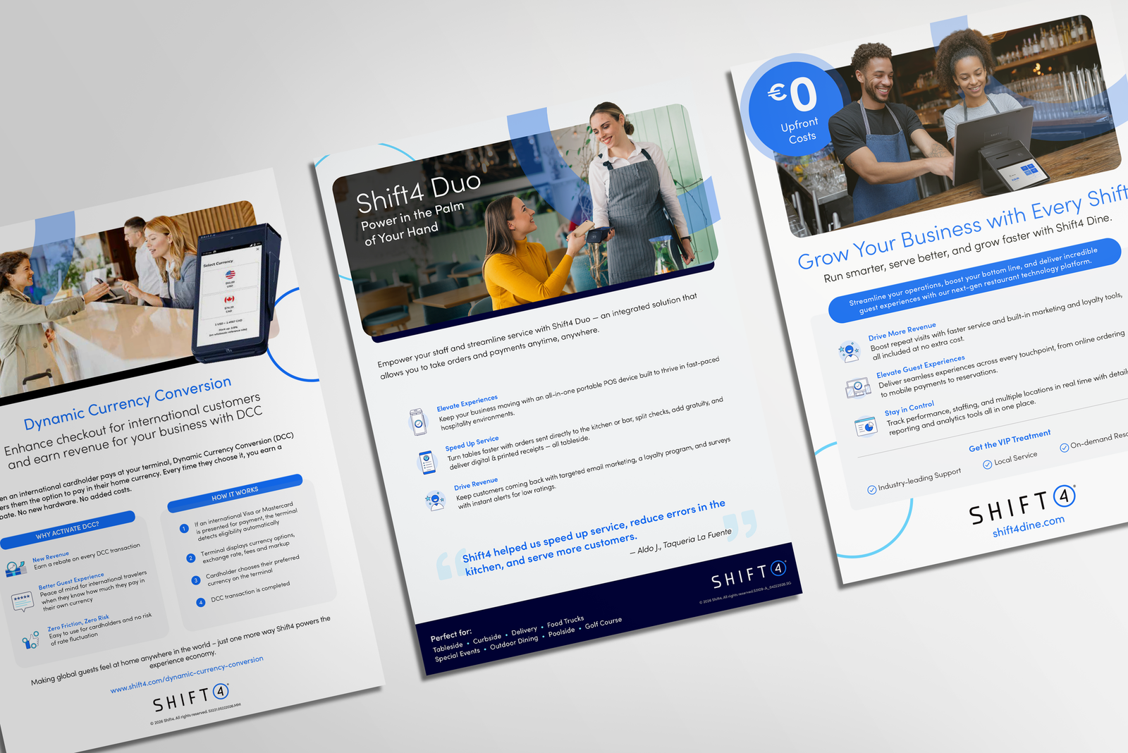
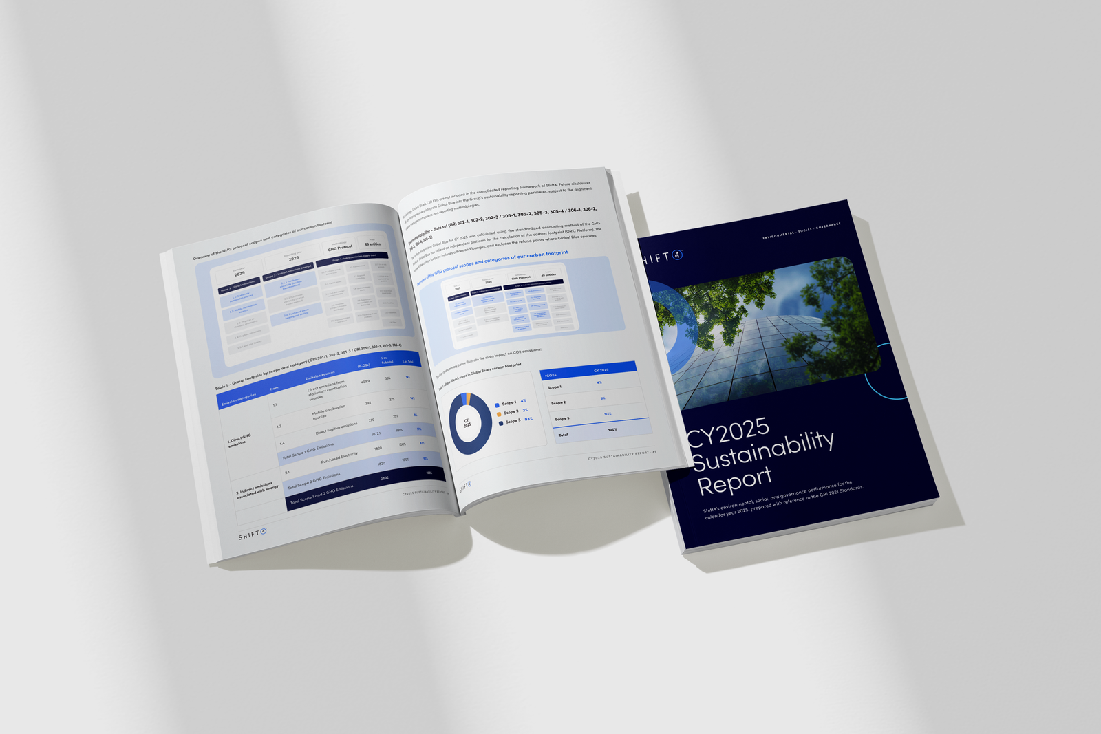
Once the core toolkit was built, including this photography treatment, new iconography, layout guidelines, cutout imagery, and PowerPoint templates, I looped in the broader design team to help apply it across thousands of assets. I also worked directly with Product and Marketing on rollout and communications to align the entire organization on how to use the new system.
As part of ensuring alignment across all merchant-facing materials, I took the initiative to work directly with our internal hardware team and an external hardware partner, a relationship our design team hadn't worked with before. I applied the new brand system to physical packaging, using Pacdora to create high-fidelity mockups for stakeholder approval, and created the dielines myself. From there, I partnered with the external vendor on color matching and gave final design sign-off.
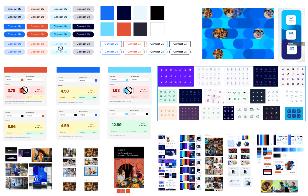
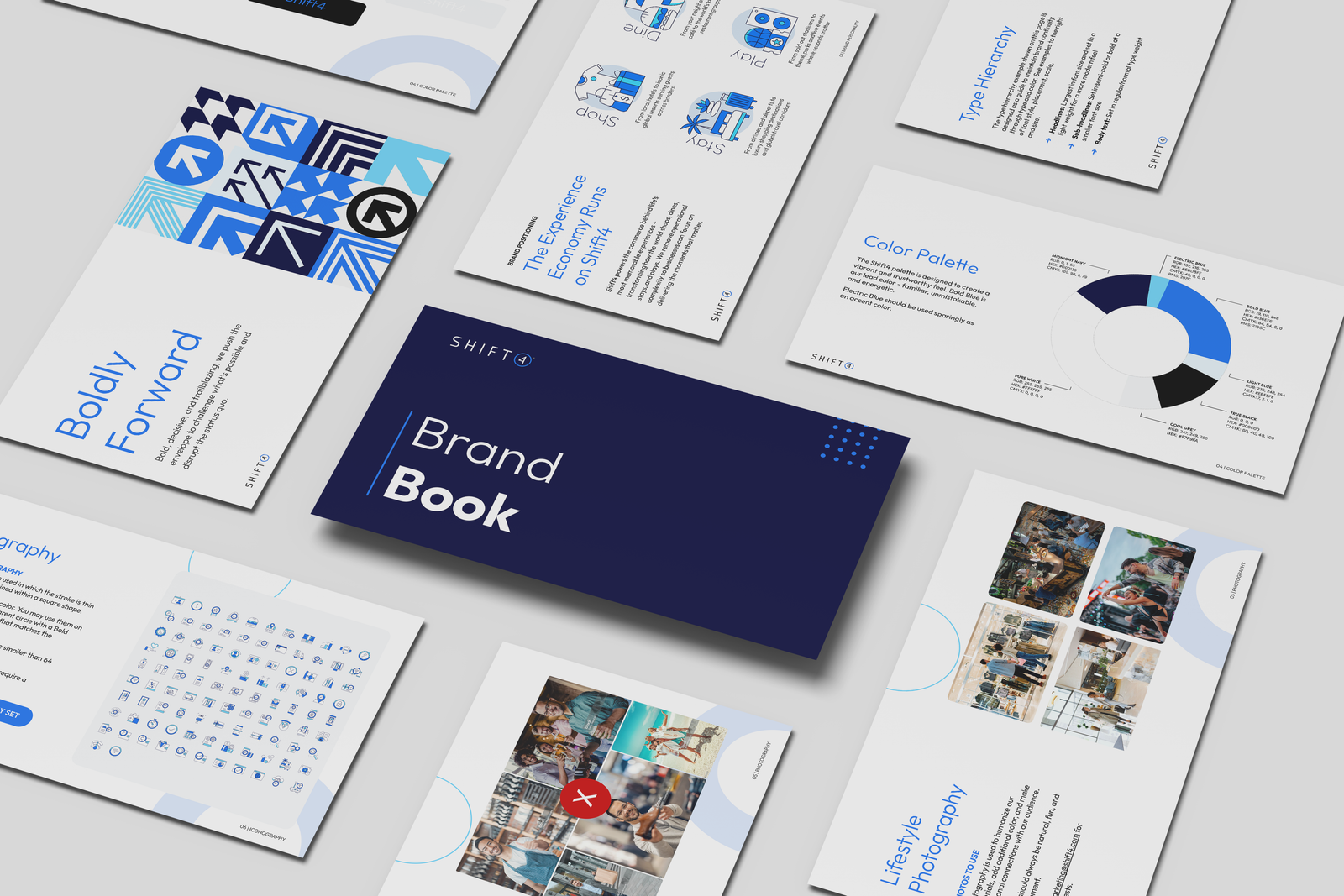
The new visual system earned executive leadership approval and praise from marketing leads, along with positive reactions from the Board of Directors. Sales teams reported the new materials were resonating better with prospects — direct evidence the shift wasn't just an internal preference, but one the market noticed.
The full system — from concept to a scalable, applied toolkit — was built in 5 months by a 5-person design team, entirely in-house. Rollout and full adoption across Executive Leadership, Operations, Finance, Human Resources, Strategy, and Engineering took one additional month. What started as a visual refresh became the connective tissue between Shift4's new positioning and how the brand shows up across every part of the business.